Saturday, March 27, 2010

Titling

Working on the blog title thing was a nightmare. I was a woman possessed by alien rabbit which forces me do make it better and better until it is just too ugly for me to continue fixing.
I worked on it from 6pm-7.30pm, then 9.30pm-11.30pm, till 12am-1.30am, just like an idiot.
First try:

  1. Grabbed one of the million sky photograph that I took when i had the sky phase, played with the curve/ lighting and filtered it to make a cartoonish feel
  2. Cutted out an image of a fly and a bee, filtered it too
  3. Got font for EinniE on dafont.com and got the Conversation honeybee font somewhere...years ago... it just had been in my thumbdrive for years
  4. Got this texture years ago from another website which i can't remember of and dumped it on to try and fix this ugly mess. I also discovered that I also have some hair textures and I add a little bit of that too.
  5. Enter light depression when discovering how cool other people's blog are. Scrape that design after remembering that my blog's background colour was yellow.

Second try: Basically the same thing as before but airbrushed the edge, change the font, still very boring. Beginning to question my level of creativity so it is immediately destroyed. Oh, and realized that my computer doesn't have winzip, so that was fun.

Third try: Now we're talking.

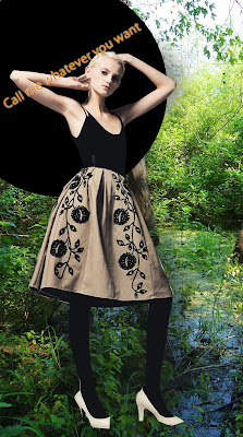
So, same font, added shadow. Played with the curve again to give a lighter look. Created a layer of light grey with opacity on at 7% then made the stain light to imitate bee hive. Added an age old drawing of a dress. Gotten another layer and did some more textures.
Then realized that I don't really want people to look at my old drawings since everyone would think that i'm copying good old Timmy and his thin drawings. I love the colour though. Makes me think of the world. Sad that i can't fit convo honeybee in so must die.


Fourth try:
Suddenly remembered my little doodle in class on monday and went "Oh yea". So i took it, grabbed it, youcamed it, super curved it, magic wanded it and dumped it on. Realized that the bee hive will be too busy so took that out, the girl will be too bright so took that out. Coloured his togue cause the image need some red. Randomly air brush and play around till I got this baby looking its best. Fixed the edge and declare a well good night.

No as pretty as I want, but then beggers can't be choosers.


Sister figured that the font of EinniE is too solid so might fix it again on easter.

Wednesday, March 24, 2010

Breathing

Breathing, seem to be a little thing (?) that becomes a common inspiration lately. Florence and the machine has a song on it (Between Two Lungs), the Sydney Dance Company’s New Creation has a part call 6 Breaths and the art world seems to always have some sort of obsession with air and breathing, and who can forget Patrick Süskind's Perfume, one of my favourite books.

As a smell person I always relish the ability to breath and feel the world. Sometimes when I walk by a crowd of people and catch a wisp of familiar perfume, I would run over my memories of different smell from my childhood, identify it, and smile like an idiot. Thus I wonder, is nostalgia the reason for people’s interest? Or is it the fact that each breath is killing us? If that’s true, does it mean that every one of us have a hidden masochistic desire? Or as my sister said, have we as a creative individual, truly ran out of creative ideas that we have to return to our roots and indulge in the simplest thing in life?

If air has a colour, what will it be?

Something to be pondered about I’ll have to say.


Anyway, something related to design. Had a moment a few weeks back when I suddenly realized that the older generation’s dress style is actually quite interesting. A little theory that I had is that since they are older, they don’t care about the fashion sense of today and just wear the colour and style that suits them. And some of them really look great.

I saw this lady a week ago when I was about to walk past the crossing, the colour and print of the jumper was so awesome I have to take a photo.

Yesterday was the senior gala concert at the entertainment centre and I saw a group of old women dressed in red and purple and oddly enough I thought, “Oh my god that is a great combo on them!” Was a little bit sad that I didn’t get my phone out fast enough to take a photo to prove it.

So I say, take a look around you and serious admire the things that people wear, not just the hot young chicks and the handsome young guys.


There it goes, I have ranted and must do work again.
Oh, art month is coming to an end so go around quickly!
And a little preview/promise that I will type now so that I will have to do it later. I will write an article on T-shirt/skin and the intricate combination of art and fashion. Those who might have hear me talking about the woman who is obsess with “liberating people from their skin/clothing” on the street by unpicking what they are wearing and then pinning it onto the wall or fence, that will be what I will type about. Will start on it as soon as I have time to find that article on that woman from this magazine at the library and scanning it.


Sorry about a post with so little images, I'm feeling a little bit down.


That’s all. Really need to start on the assignment now.

Friday, March 19, 2010

Scanning

How to scan using the scanner at the library:
  1. Get a computer that is connected to a scanner
  2. Double-click on the scanner looking thing on the desktop
  3. Choose the resolution desired on the left hand side
  4. Place image onto scanner
  5. Click Scan
  6. Choose destination
  7. Save
  8. Done

Descreening reduces the amount of interferences (moire pattern) in a scanned image. It is important as it reduces the quality and clarity of the image, making it less visually appealing. The scanner I used does not have a descreen setting.

From the following images, I concluded that 75 DPI is enough for web as these images rarely needs to be viewed in such detail and upload time increase accordingly to size. 150 DPI is best for presentations as it is clear enough to show details but it is small enough to not take excess loading time, which can prolong the presentation too much and allowing attentions to drift away. 300 or more DPI are best for printing as it creates a better image when printed, and its size will be too big to do other things anyway.


These are 3 different resolution of the same image. All colour mode are RBG.

300DPI

150DPI75 DPI

75 DPI300 DPI

300 DPI75 DPI

Layering

One of the most embarrassing and frustrating things that can happen when using Photoshop is when you had spend hours trying to alter an image and nothing seems to happens. So save yourself some time by placing your layers in the right order and check which one you are working up before throwing your laptop out of the window.

Tips:
  • Usually, when you just saved a document or done something drastic, photoshop tends to revert to the layer on top no matter what, so check before use.
  • Place your layers in the right order so that you can actually see the effect as a whole.
  • If you want to see certain things more clearly, try and hide the other layers by clicking away the “eye” next to the layer.
  • Personally, I like to unlock all layers as it makes my life much easier. If you have time, play around with layers and opacity as it may give a more interesting image.

Otherwise, these are some examples of changes to position and layering of images:

This is the way that I designed the layers to be,

I altered the position of the black circle and place the layer over the girl so that she can now have an awesome skirt. Then I placed the words under the layer of shadow.

Now, I place the circle, the girl and her shadow under all the layers so that she disapears. See how much more interesting the image is!

Wednesday, March 10, 2010

Homework Time

Not quite sure if we are meant to do it this way but...

I am currently following:


1. The Terrier And Lobster -
http://dustyburrito.blogspot.com/


Basically stumbing into it somehow though a million hyperlinks.
Ok, maybe because I was googling on one of my favourite model, Jean Patchett.
She is absolutely lovely, especially in the dress by Jean Desses.
As seen in:
http://dustyburrito.blogspot.com/2009/08/jean-patchett.html


I love how they feature photos from older magazines or books and have a post full of photoes. It is great that I can basically catchup on the magazine photoshots that I missed because of the "No Distraction" policy during the HSC and the time when "I can't afford anything more then $2 per week". They seemed to be interested in designs that are quite romantic and soft, which indulges my inner nostalgic self. They have new post every day, sometimes more, making it great when I am bored or when I refuses to do my homework. (Sorry to all the lectuers and Tutors)

Currently in lust over their post on "Alice in Wonderland" since I just watched the movie, in 3D, at imax.

You have to love Jean Paul Gaultier as the Cheshire Cat. (Mini yay for the Cheshire Cat)

And now a huge yay for John Galliano as the Queen of Hearts and Alexis Roche as the King of Hearts


2. Bluetramontana Style - http://bluetramontana.blogspot.com/

Basically a fashion blog with things that I like. It also updates a lot with comtemporary designs and excellent photographs. I wanted to post some photoes but can't choose between them, and that my used internet usage is quite high this month.

3... Not really a fashion blog but

Heidi & Seek

Ridiculously cute designs that I believe is actually wearable in a day to day bases. Also, the big thing is that she does ethical fashion. That gets the bells ringing in my head so I have to follow her. Plus she's an Aussie!

From her webby:
"Heidi & Seek does not sacrifice good design to be green. Hayley's clothing is not intended for wear in one season and a deposit in the charity bin the next. These designs are wearable, individual and nonconforming to fad trends. Each garment is one-of-a-kind."

Some of her designs:


Well.
That's all.

Thursday, March 4, 2010

New Discoveries

Homework... will happen soon. Interesting discoveries first.

-> I was thinking about what Lea said on last year's class creating a facebook group when I realized,

Fashion And Textile Design = FAT Design


Excited!


-> A little bit of a suck up post, but, the past UTS student Rachael Cassar was one of my HSC major projects inspiration. So yesterday night when I was searching for blogs to follow, I went to her site (
http://www.rachaelcassar.com/) and realized that she had a new collection called Ruby last year inspired by crows/ravens. The thing is, I had crows and ravens as my main inspiration for my MTP wtihout ever knowing that she did a new collection...

My design was pretty crap and no-one ever need to see it, so here is a few photo that I nicked off her site.

Ruby 2009 by Rachael Cassar
Images from
http://www.rachaelcassar.com/


Some of my old favourite from her:

she grows 2007

As the world falls down 2006


Falling intensely in love with her designs again!

Let's start the nightmare

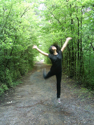
OK. I don't like things being naked and boring (maybe that's why I'm doing this course). Therefore, this is a photo of me.


Good, now I can sleep tonight.


P.S. Yes, I will start on the homework tomorrow. Gosh, a fashion blog. I just took 15 minutes editing this post, how is this going to last for a year.